
Summary
PAPA Adventure is an online programming education platform for children.
The redesign of the PAPA Adventure website aims to create a more immersive, engaging, and fun learning experience.
By integrating intuitive navigation and gamification elements, we encourage children to explore independently and participate actively.
My Role
Design strategy / End to end experience design / Usability study


Review The Current Situation
Analyze the existing pages from three parts: business level, data level and experience level.
Business
Not conform to the new business policy positioning
No strategy to distinguish between new and old users
Data
Complex pages lead to low space utilization
Not optimized according to users' learning preference data
Experience
The course product conversion path is long
Visual design and brand do not align well, leading to a poor brand perception

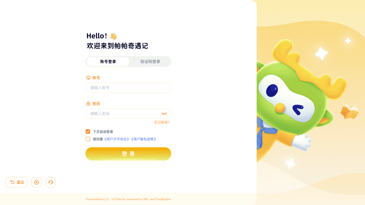
Previous-Main Page
Previous-Subpage
Business Goal
Clear business core appeal: Increase course product conversion rate.
This goal is reflected in improving the learning experience and parent services, attracting loyal users to continue repurchasing, and upgrading the interactive visual experience.
User Research Findings
We did a user study to assess what barriers prevent customers from purchasing online courses.
Key findings from user research :
Users spend a lot of time choosing the right course.
Users want to clearly understand their learning schedule and progress.
Post-lesson Q&A is especially important for users who purchase courses.
Users hope to have free courses available for trial.
Users wish to have a community for learning and exchange.
Design Goal
Adjust page structure
Adjust modules based on data to focus on course experience.
Lower decision threshold
Provide decision aids to help choose the right course or learning path.
Increase attractiveness
Align visuals with brand and optimize gamification and reward mechanisms.
Comply with educational regulations
Ensure courses and platform comply with educational laws and regulations.
Designing Down For A Vision

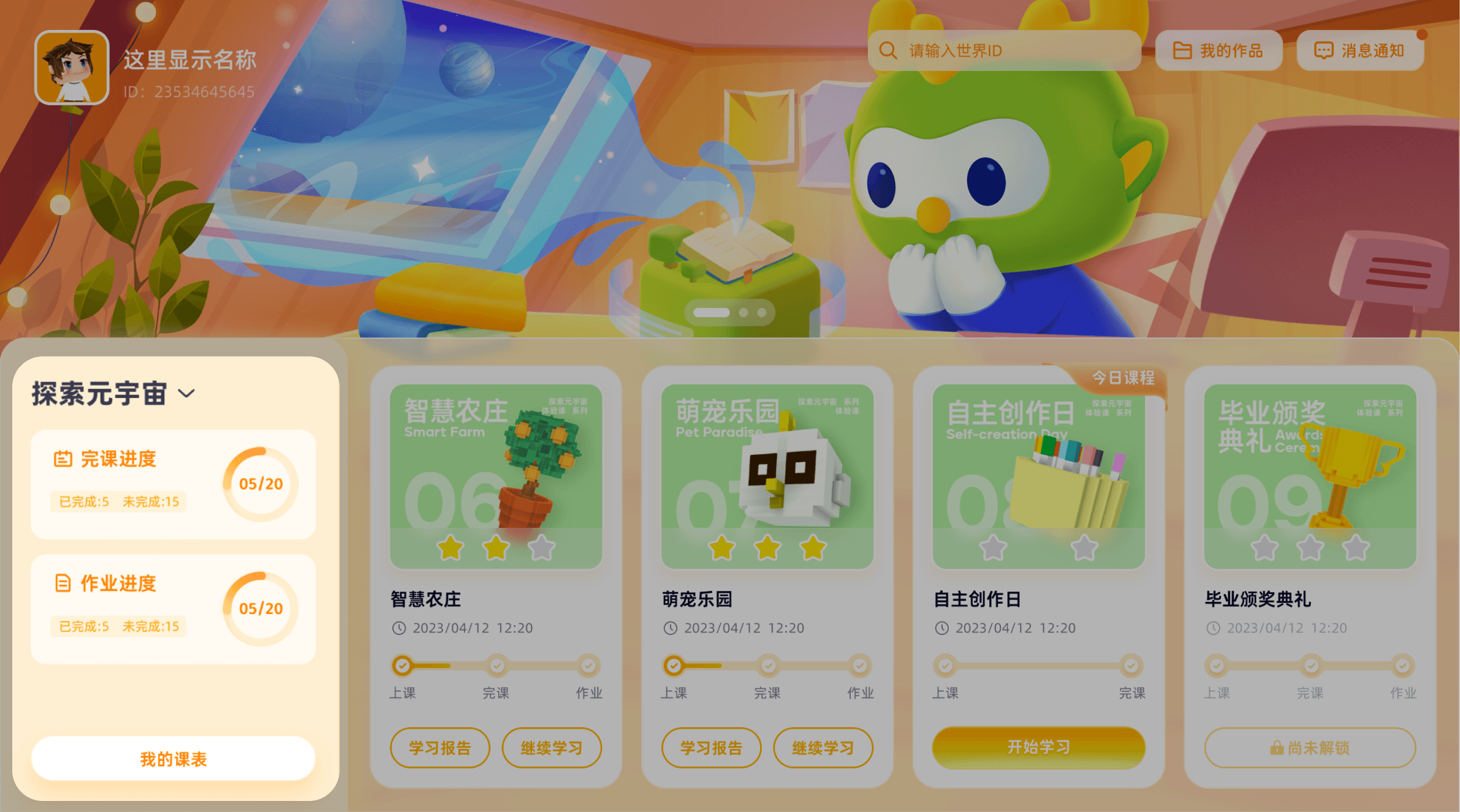
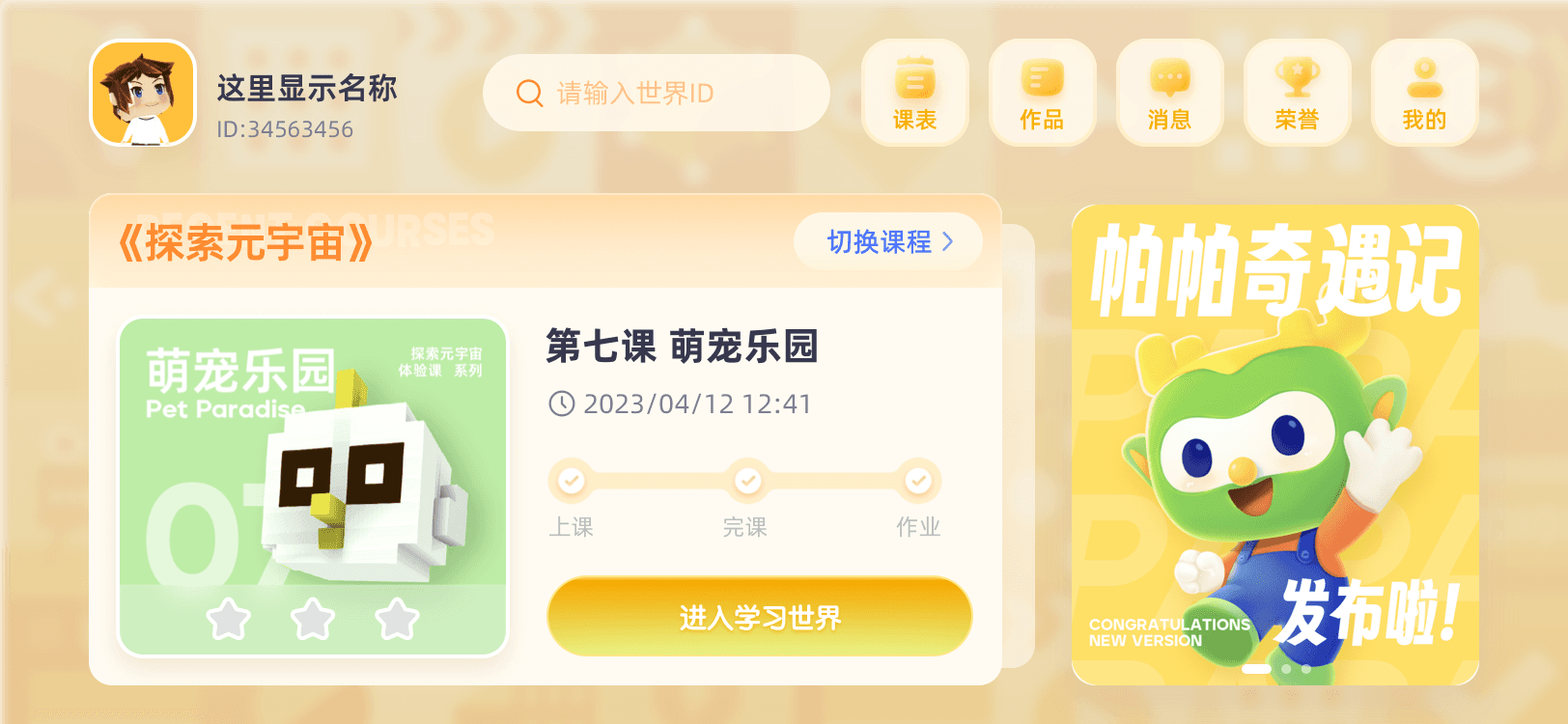
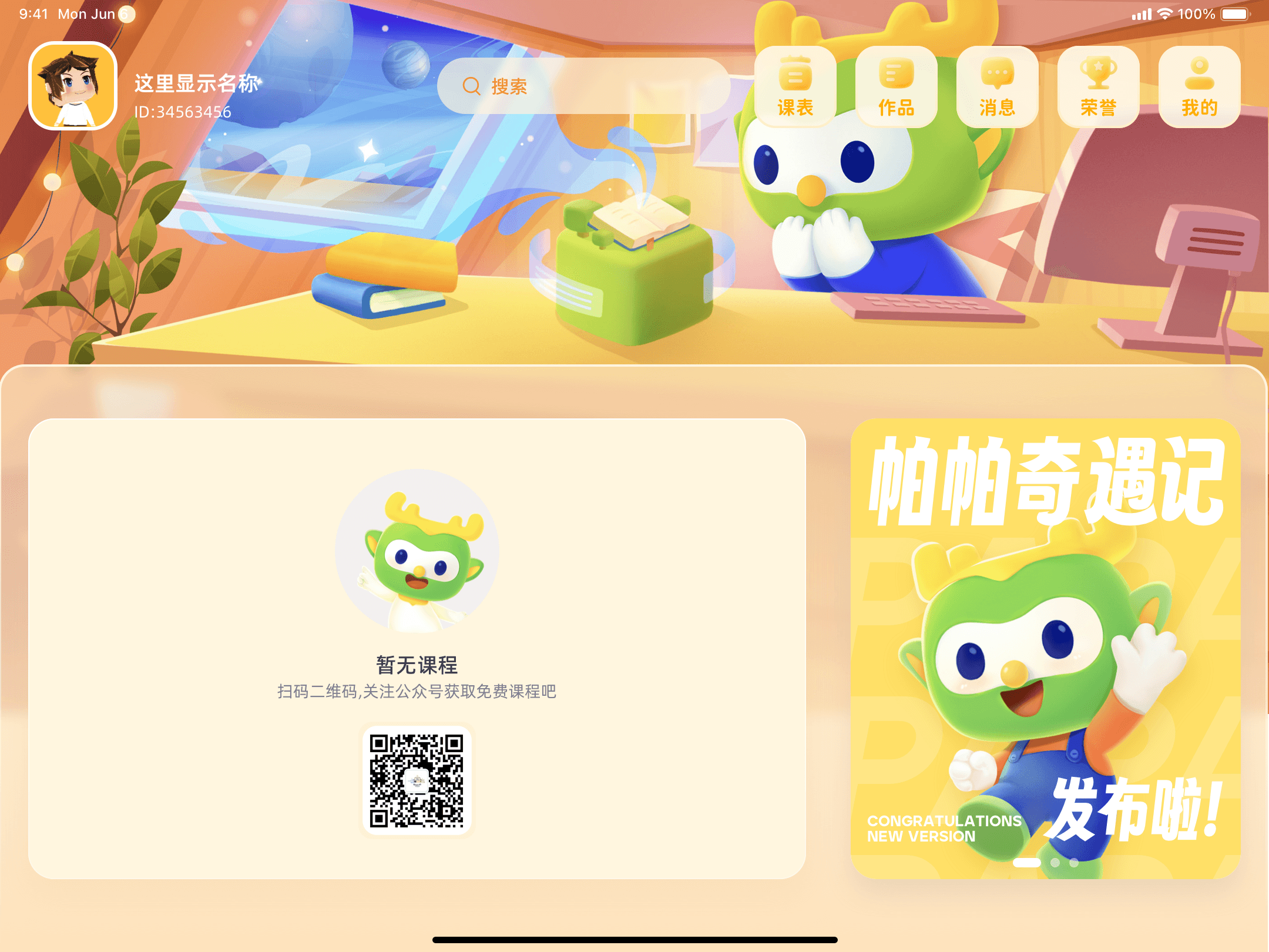
final homepage
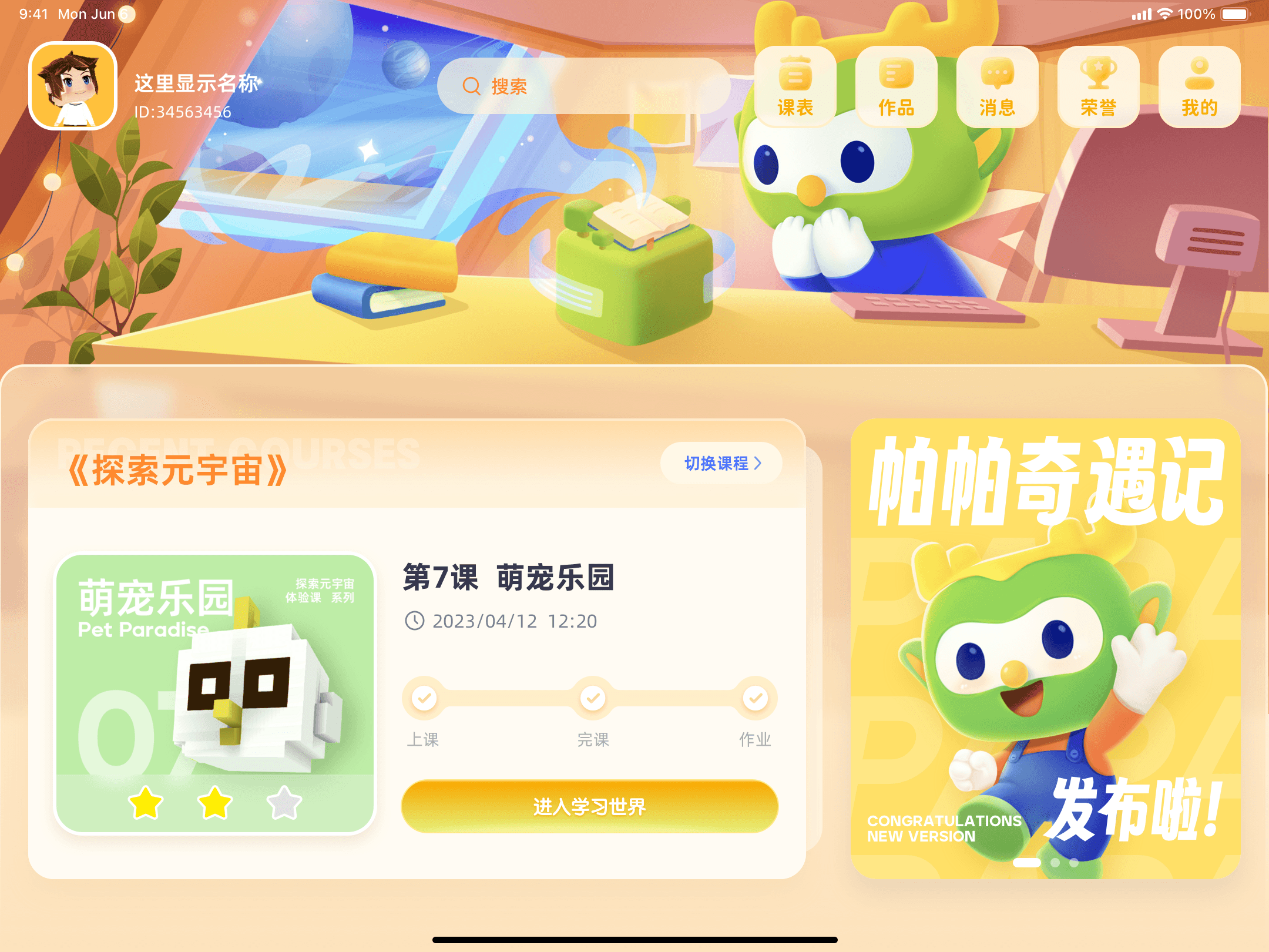
Combine business and data to adjust information structure
Delete modules unrelated to course services
Tools Center
Navigation
Showcase
Info Bar
Based on user data, users are sensitive to programming activities, promoting engagement. Thus, the first screen keeps marketing content visible.
marketing content
Based on the data, advanced programming tasks show lower completion rates, so only basic tasks are emphasized.
basic course
According to the research feedback, add new modules that meet the needs of users.
Learning Progress
The left-right hierarchical information structure ensures that important information is not lost among a large amount of content.


before — after
Provide decision-making assistance for new users
Reduce decision-thinking costs by standardizing course covers
Each course is displayed in a card format, showing the name, difficulty, rating, and progress. This provides clear guidance for new users to choose courses based on their interests and skill levels.

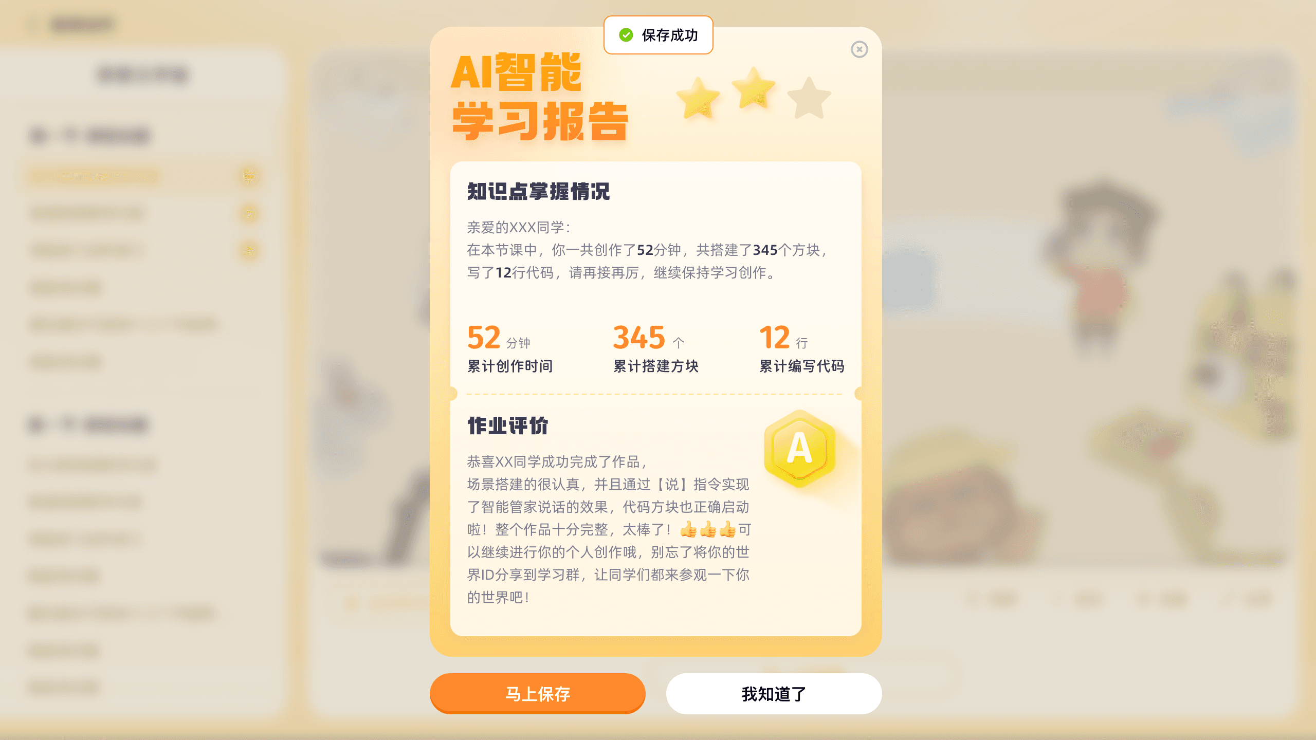
Provide data details design to enhance the user's sense of mastery
In the learning progress module, follow the logic of data overview - visual chart - details to build the module, to help users better understand their learning progress.
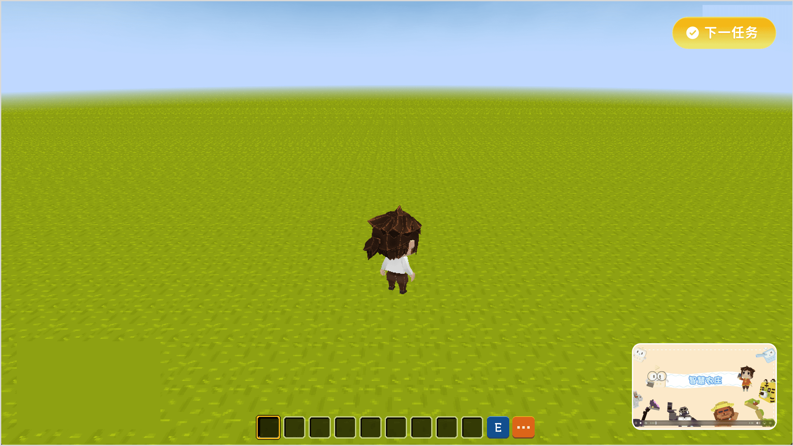
Extend to more scenarios
Playback experience
After a quick exploration of the page’s overall look and feel, I designed three different interaction models for the video playback page. Our goal is to provide users with a convenient and comfortable way to browse videos and create an immersive learning environment.


model 1
model 2
model 3
Full-Screen & Autoplay
Usability testing shows that a full-screen video format enhances immersion, making it easier for users to stay engaged.
Autoplay keeps users watching effortlessly, reducing resistance to learning.

Floating playback
After finishing a course, users can switch to the coding page for practice while the video continues in a floating window. This design enables easy page switching with minimal disruption to the content.
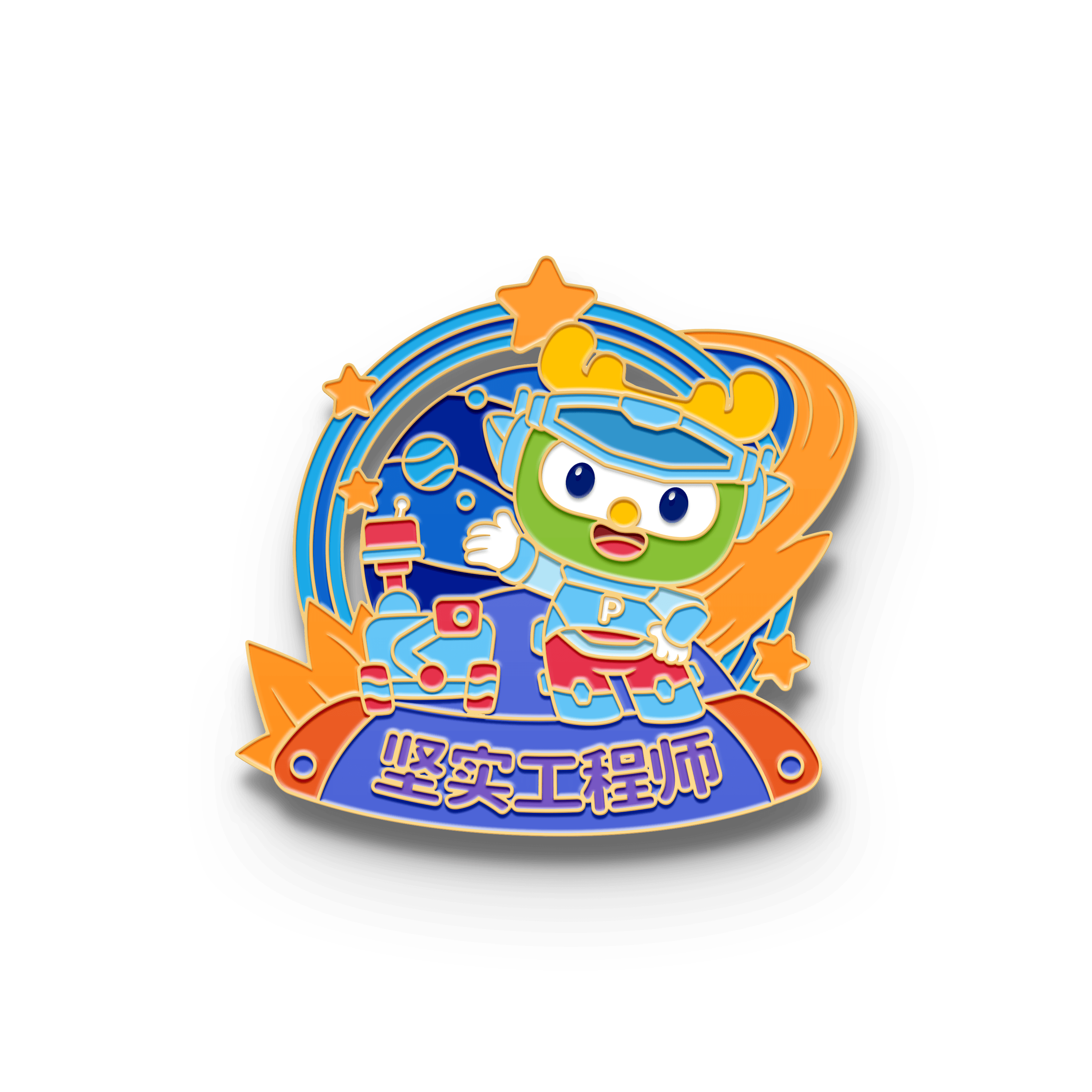
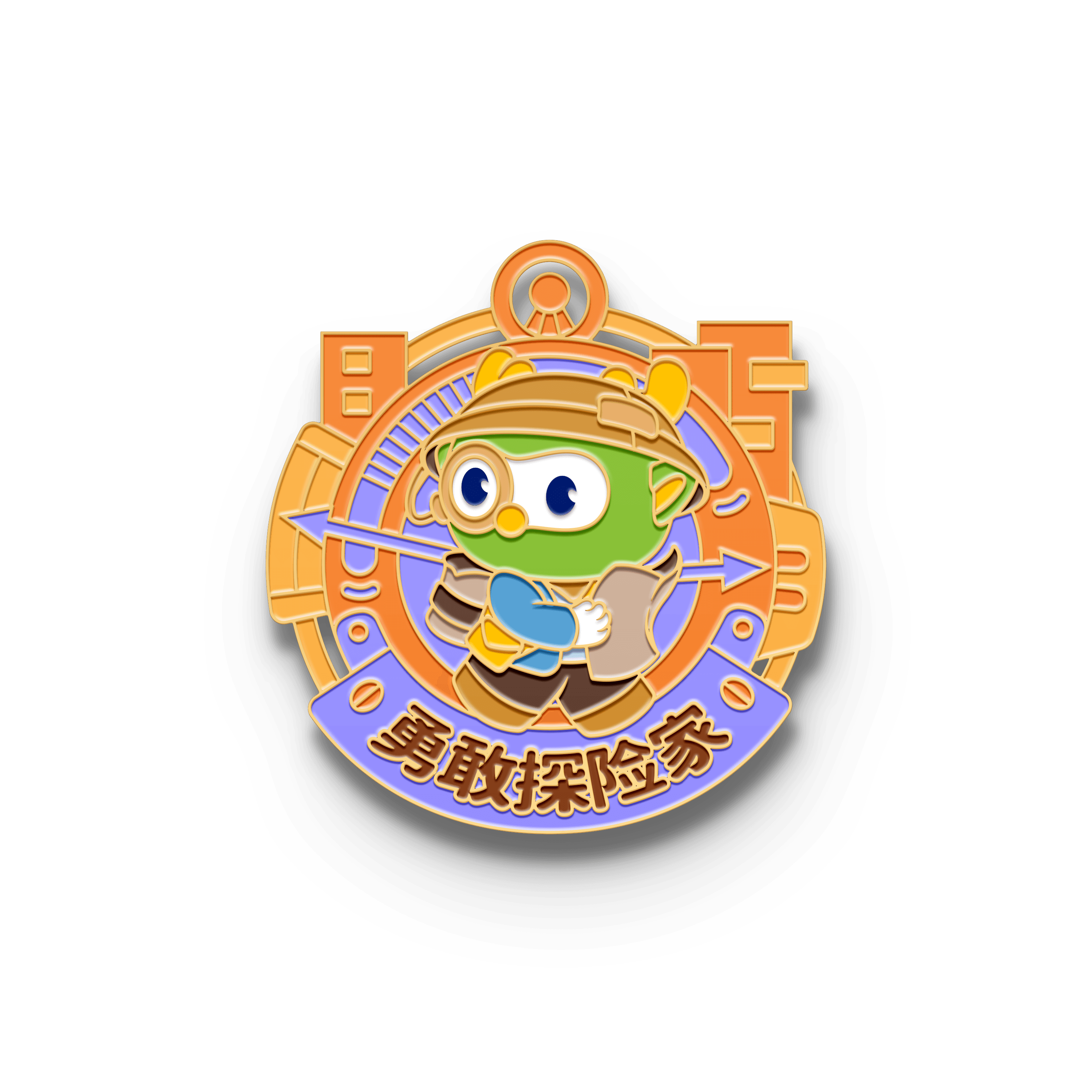
Gamified learning experience
Combining learning feedback with badges, encouragement, positive reinforcement, and vibrant visuals creates a dynamic and engaging motivational experience.


Visual Explorations : )
I created a mood board before starting the design to capture the overall feel of the page.
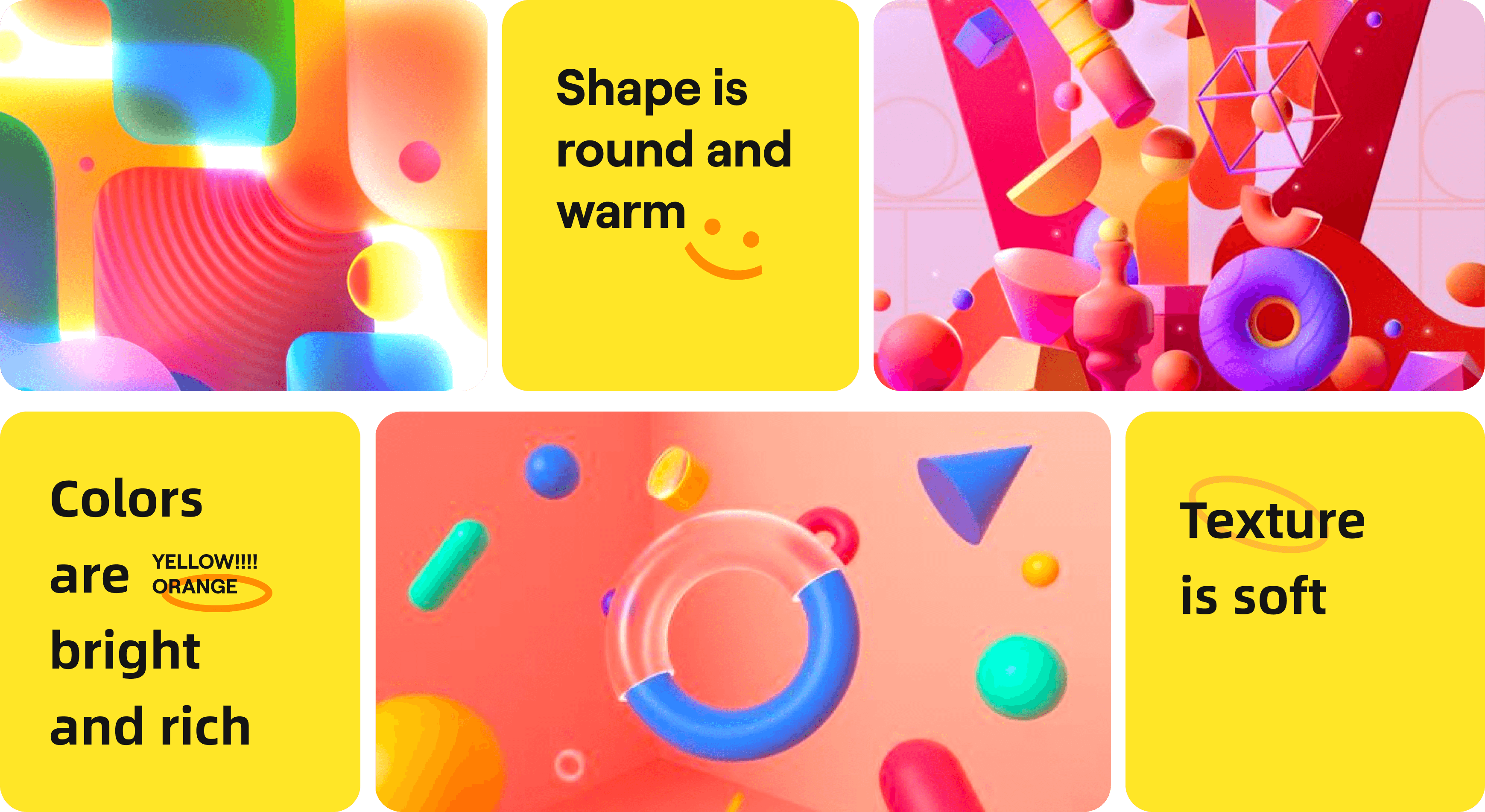
High saturation colors in the UI create a youthful, energetic feel, directly conveying the product's attributes. A bright orange was chosen as the primary color.

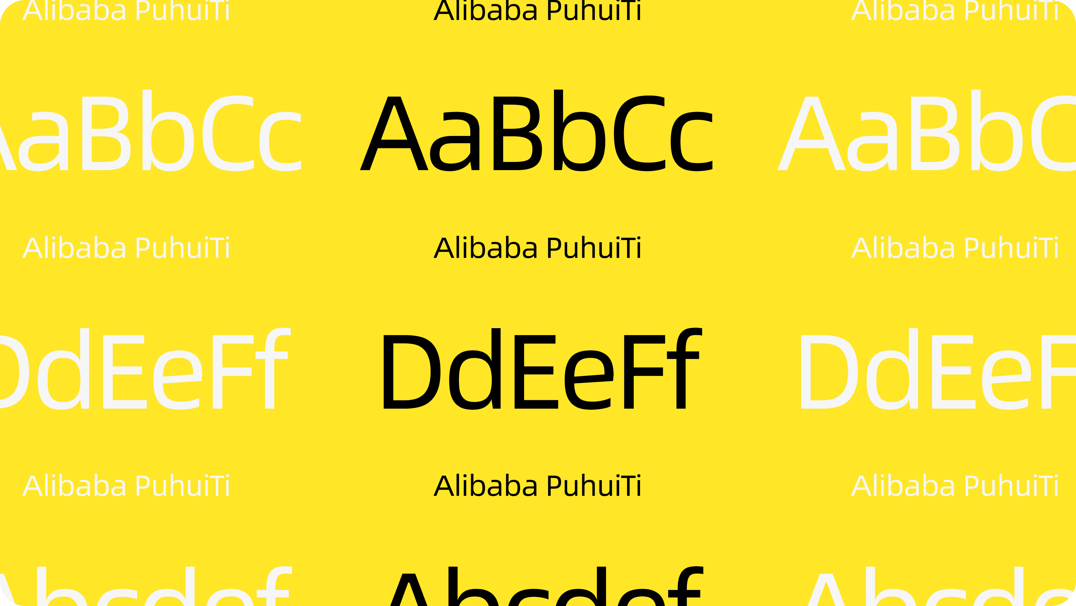
Sans-serif fonts were chosen for their modern, clean look and easy readability across screens.
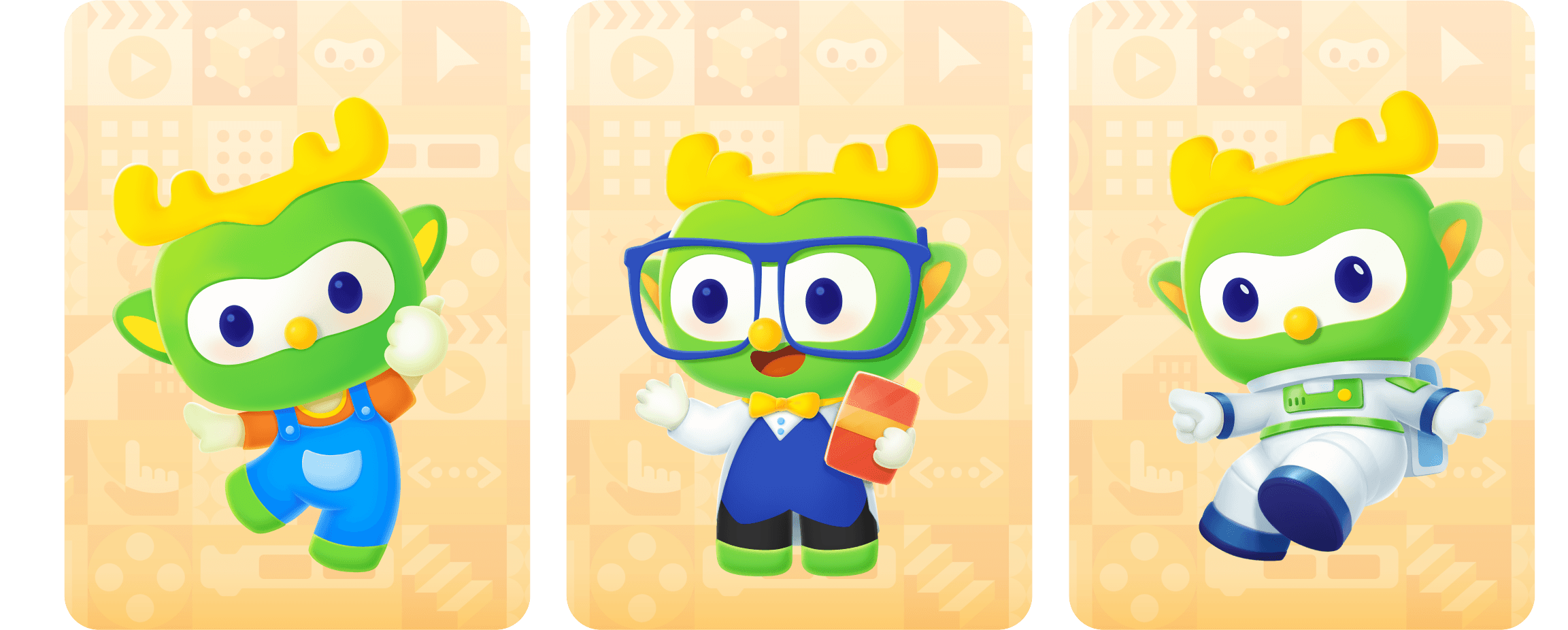
Brand Design
Increase attractiveness through visuals that align with the brand

Responsive Design
I have also set responsive rules for different screen sizes to ensure a consistent experience across various devices.


Data validation after launch
PC conversion rate
Click-through rate

Two weeks after launch, the PC conversion rate increased by 4.66%, and the class entry click-through rate increased by 3.17%.